User Experience Guidelines – Payment Button Size and Anatomy
Payment buttons must be consistent in visual appearance to other buttons in the shopper experience.
Height for payment buttons ranges from 40px (Small) to 56px (Large). The default button height is 48px. The following presets can be used for button height.
- Small: Height 40px
- Default: Height 48px
- Large: Height 56
Anatomy
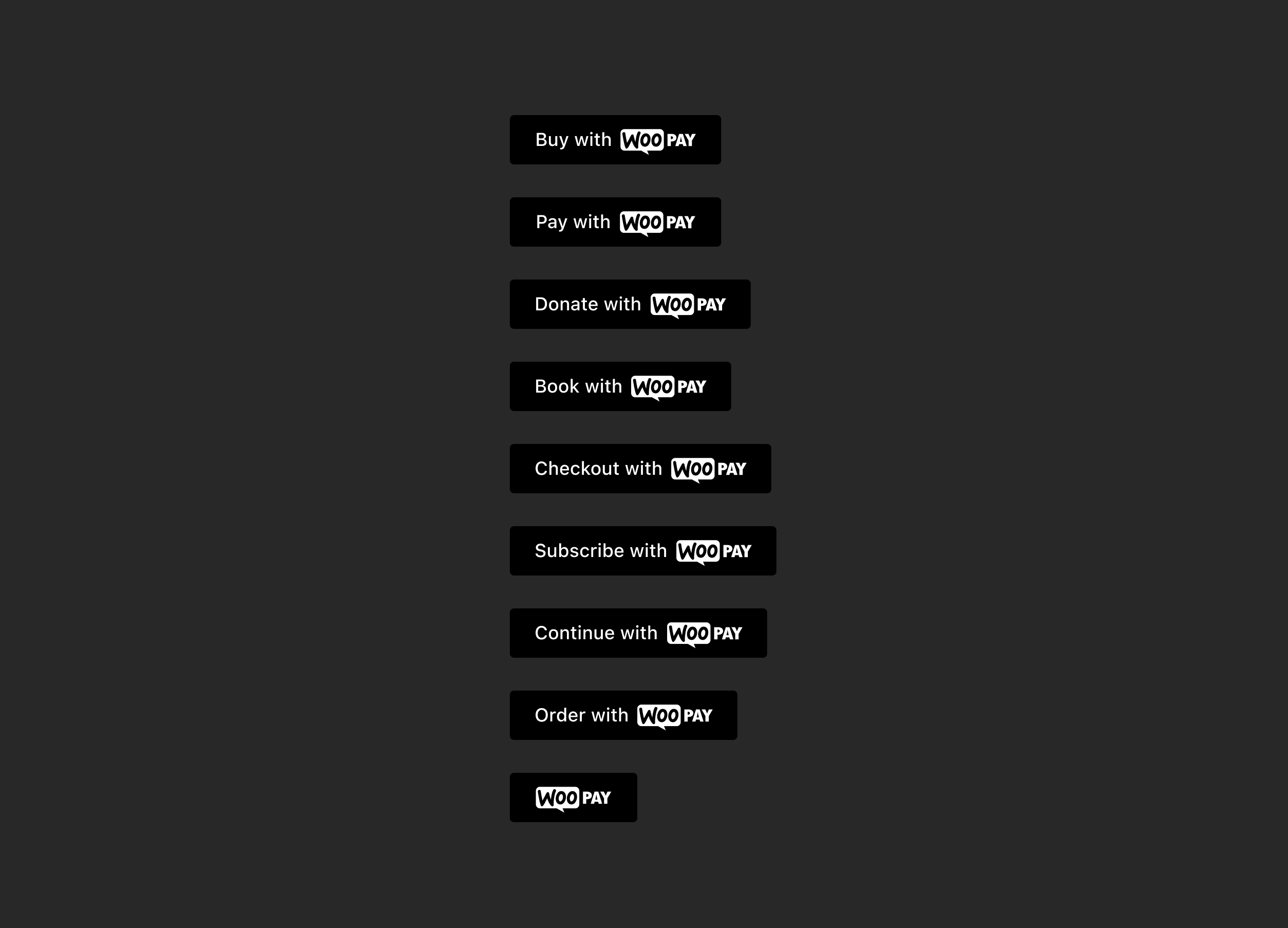
Payment buttons consist of up to three elements: a button component, payment logo, and optional label. [Anatomy.png]
Don’t place any text outside the surface area of the button.
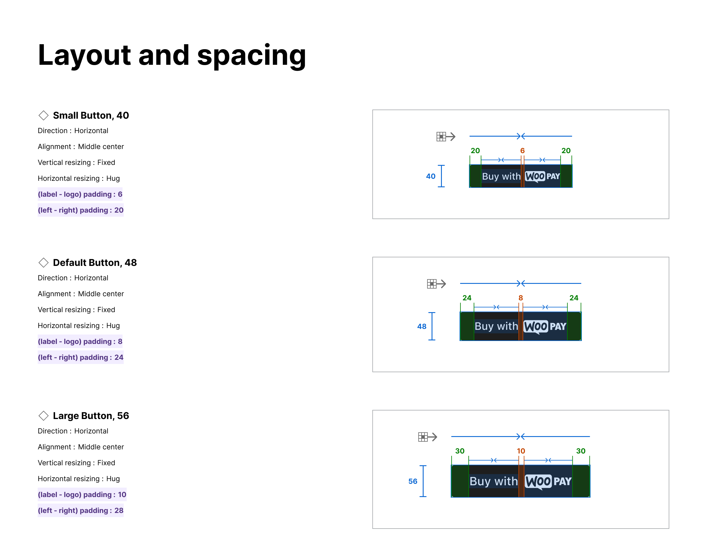
Layout and spacing
The spacing between and around the Label and Payment Logo adapts based on the size of the button.
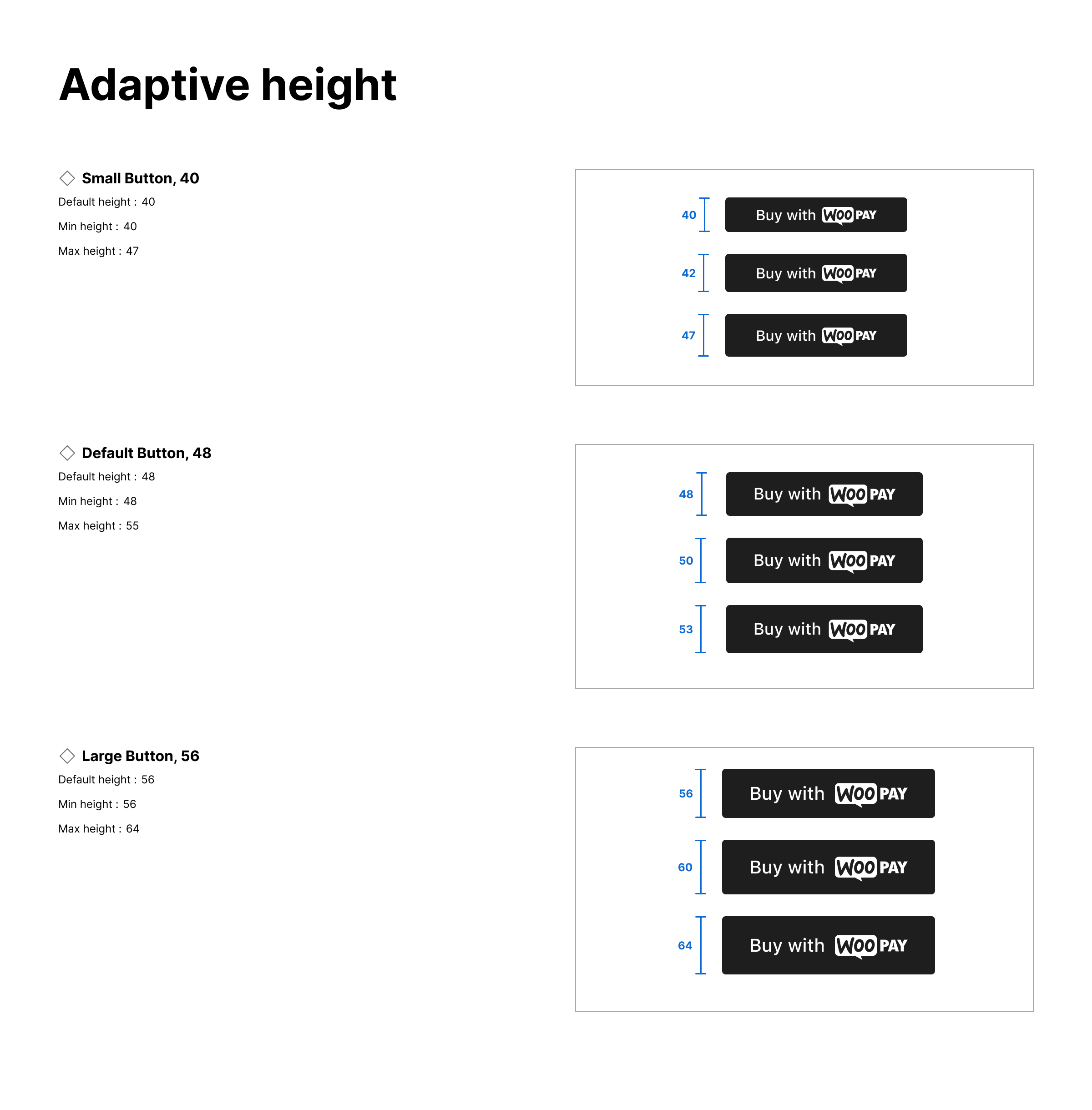
Adaptive height
The height of the button can adapt based on the needs of the theme.
Button size
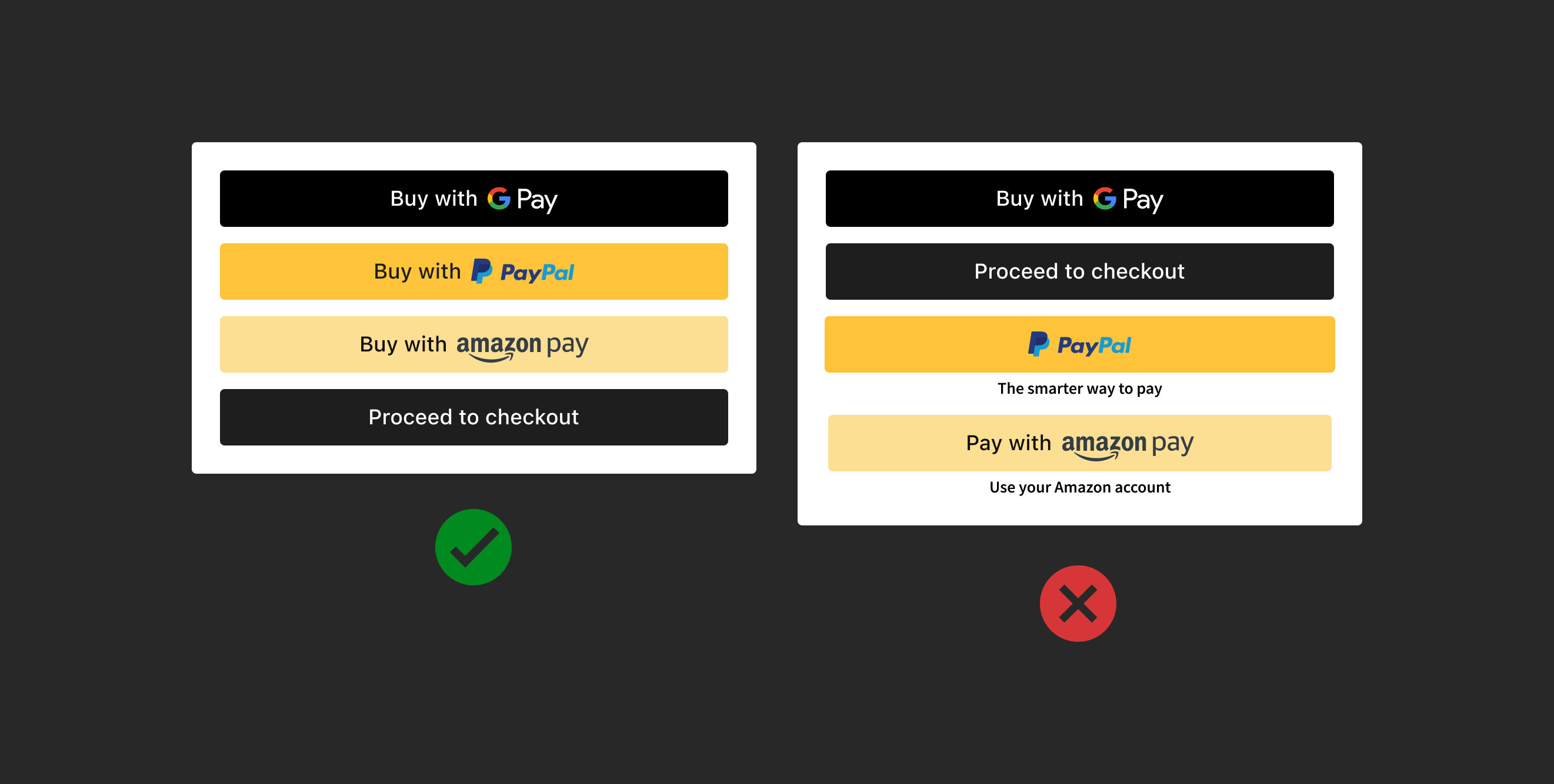
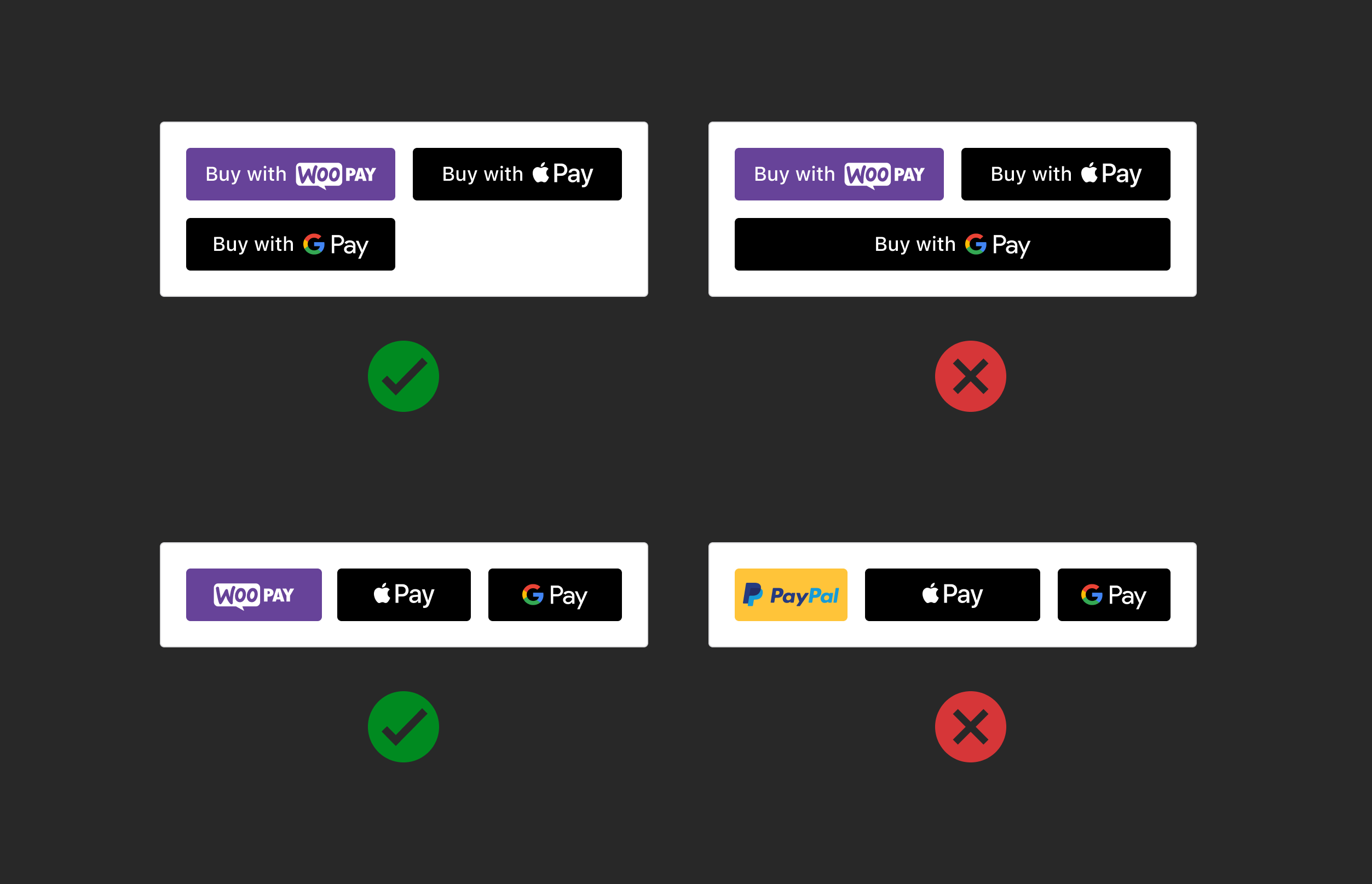
Make payment buttons the same size, no bigger or smaller than other payment buttons, including the CTAs “Add to cart” and “Proceed to checkout”
Button width
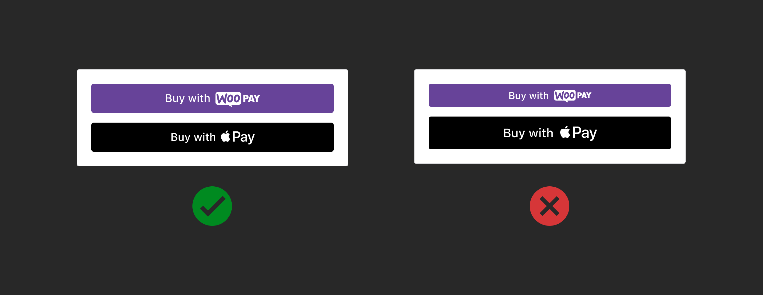
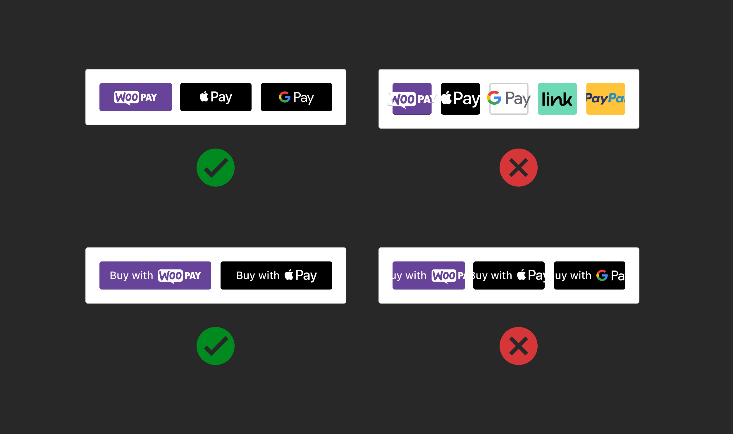
Use the same width size for all payment buttons. Don’t make the width larger or smaller than other payment buttons.
Minimum width
Buttons have a minimum width to ensure readability.
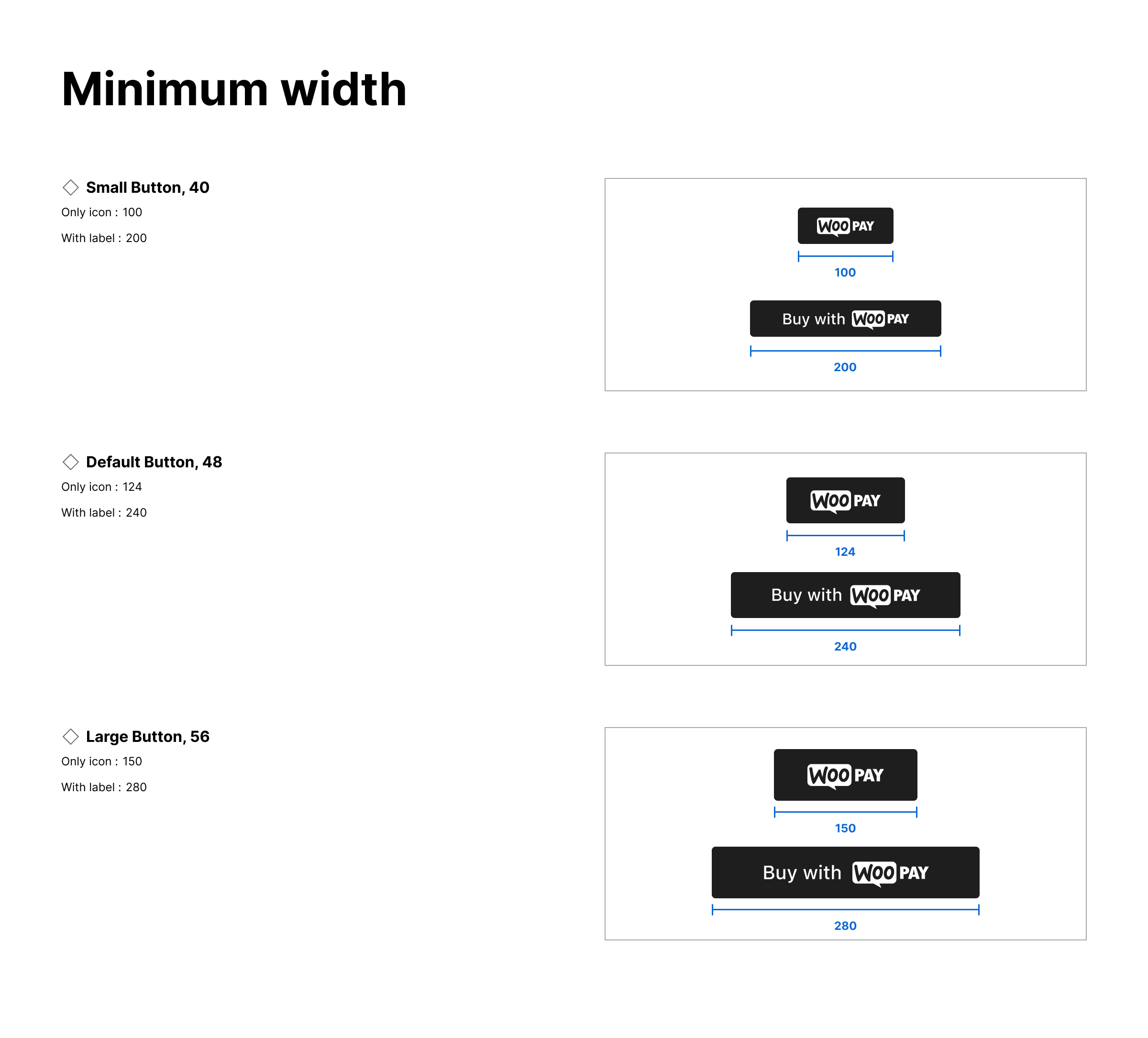
Follow the minimum width of each payment button size. Don’t squeeze payment buttons in a single line.
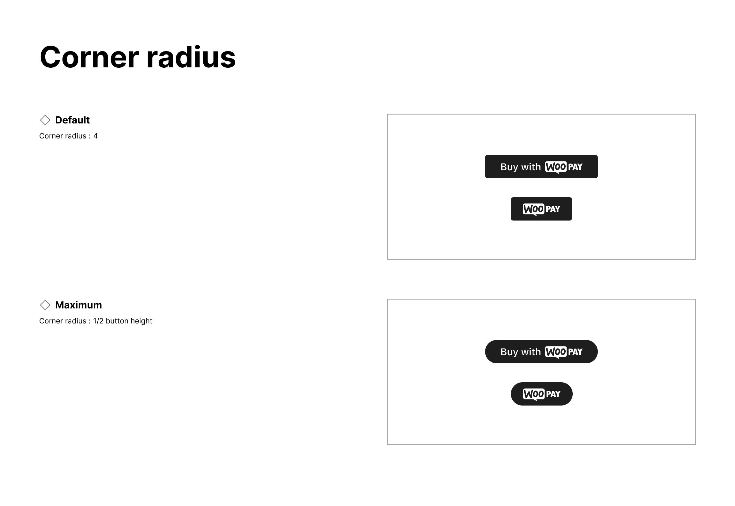
Button Shape
Use the same corner radius for all payment buttons. Don’t make the corner radius larger or smaller than other payment buttons.
- Default corner radius: 4px
- Maximum corner radius: ½ button height
Button Label
Provide variant buttons to accommodate merchant needs and payment experiences. Buy Pay Donate Book Checkout Subscribe Continue Order Icon only
The button label should appear in sentence case, with only the first letter of the first word capitalized.
Last updated: April 09, 2024